
The other day, while searching for fun beer related images to post on our social media pages, I came across the graphic below. For reasons I will soon explain, it left me feeling more than just a tiny bit annoyed.
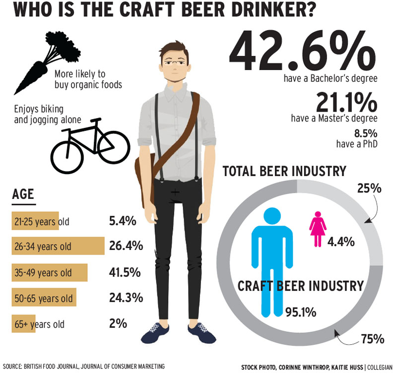
Now then, let’s dismiss the actual demographic information…as it might actually be relevant…and focus for a moment how the creator of this image chose to visualize the typical craft beer drinker.
As I understand it, the publication that originally published this artwork sees the typical drinker of craft brews as a granola eating, skinny jean wearing, banana seat riding, too cool to be trendy, hipster.
What a load of crap! I drink craft beer, and I’m not a hipster. Justin and Brian drink craft beer too, and they aren’t hipsters either. Don’t let Justin’s glasses fool you. He might be artsy fartsy at times, but the man makes steel for a living. He’s a Regular Guy through and through.
I know a lot of guys who drink craft beer, and they don’t look like some cartoonish emaciated cooler-than you douche bag.
They look more like these guys:
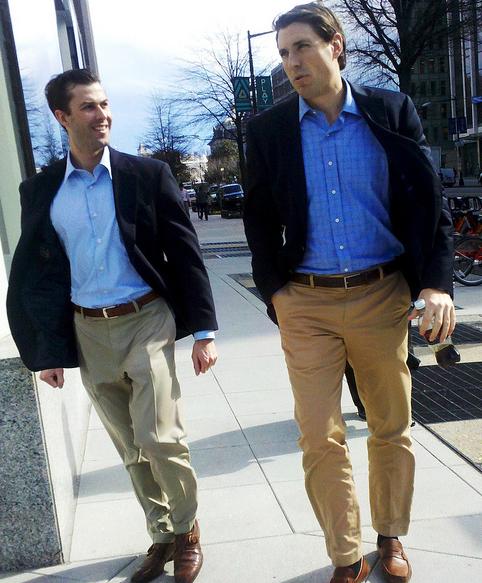


And especially, this guy:

My point is this: Too many people, craft brewers included, think of the typical craft beer drinker as some kind of self-important, cooler than you, elitist snob. Such simply is not the case.
 Regular Guys might be relatively simple creatures, but we do like the taste of a good beer. We deserve to have our drinking needs catered to by a company that understands that fact.
Beer should have body and substance, but it doesn’t have to be so highfalutin that you have to live a fake lifestyle to claim to be a fan of it.

I think you may be reading too much into this picture.
I read what I read. Whether that is “too much” is certainly debatable. As someone who works in graphic arts I understand that there are definite meanings and intentions behind visuals. It’s true what they say, images are worth a thousand words. Images are like shorthand. This designer of this image decided that the easiest way to visually connect A (craft beer) and B (its typical drinker) was to show a hipster. Now, in their defense, it is pretty difficult to think of a singular image that can fully encapsulate craft beer drinkers. Show a guy in a suit, craft beer seems elitist. Show a construction worker, craft beer seems working class. Show a woman, it seems feminine. So i understand that they were probably between a rock and a hard place…though I doubt they lost any sleep over it.
But images definitely mean something, and whether they meant to or not, they were telling a story. It might not mean much to people like you and I who know better…but it sends the wrong message to those not in the know. It says to that person, yet to take their first sip of Sierra Nevada or Flying Dog, that craft beer is not for them. That was doing that person a dire disservice.
I don’t think that most people would ever read that much into that image. Also, “dire disservice” seems like it should probably be hyperbole…
hyperbole..hyshrmerbole
Pingback: Here’s a graphic I can get behind. | Regular Guy Brewing